Why Every Business Needs a Mobile-First Website in 2025 (And Why It’s Embarrassing If You Don’t)
It’s 2025. If your customers have to pinch, zoom, or squint to read your "About Us" page on the train, they aren't becoming customers. Here’s why mobile-first isn't an "option" anymore—it's survival.

Let’s be brutally honest for a second. Where is your phone right now?
Is it in your pocket? On the desk next to you? Are you literally reading this article on it while waiting in line for coffee, or perhaps sitting on the toilet? (No judgment, we all do it).
We live on these little glowing rectangles. We shop on them, we research businesses on them, we doom-scroll on them at 2 AM.
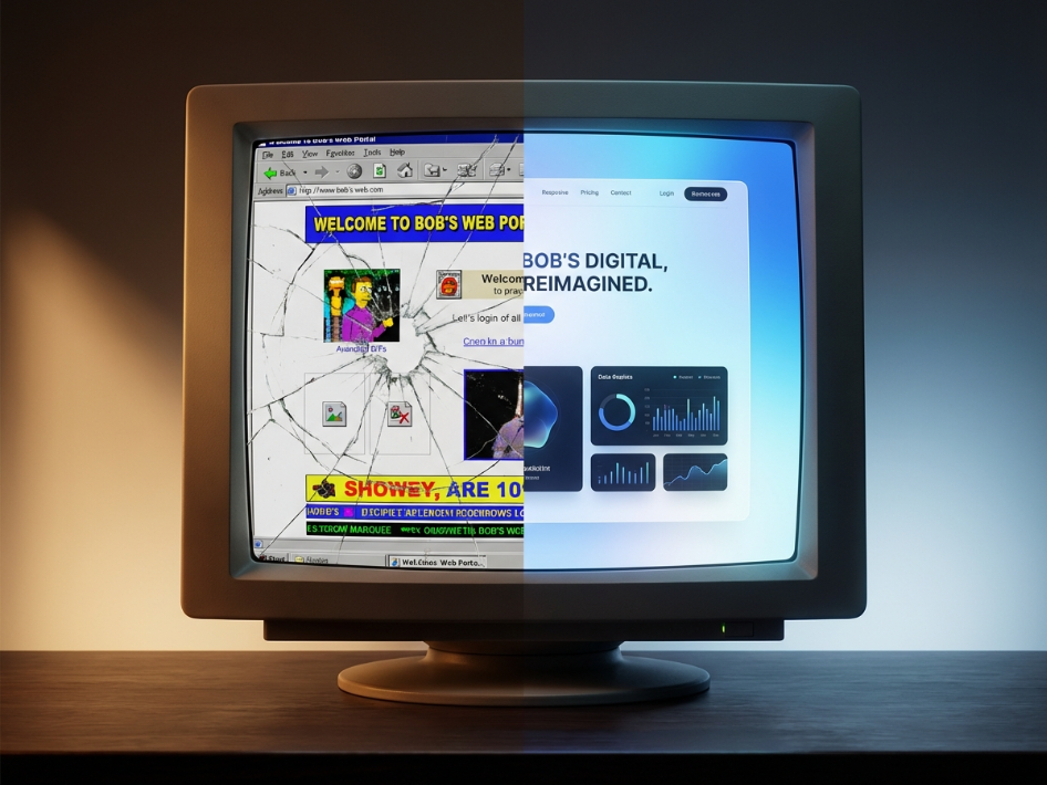
Yet, in the futuristic year of 2025, I still stumble across business websites that look absolutely stunning on a 27-inch iMac, but turn into a digital dumpster fire the second I open them on my iPhone.
If you are still treating mobile visitors as second-class citizens, you aren't just leaving money on the table—you're actively shoving it into your competitor's pockets.
It’s time to stop "adapting" to mobile and start putting it first. Here is the tough-love reality check on why your business needs a mobile-first website right now.
The Google God Has Spoken (And It Hates Your Desktop Site)
Let's start with the entity that controls your destiny: Google.
Years ago, Google switched to "mobile-first indexing." In plain English, this means Google predominantly uses the mobile version of your content for indexing and ranking.
Google doesn't care how pretty your video background looks on a desktop monitor. It cares if your site loads fast on 4G and if the text is readable on a 6-inch screen.
If your mobile site is slow, clunky, or just a shrunken-down version of your desktop site, Google notices. And Google will ghost you. You’ll be buried on page 7 of the search results, hanging out with conspiracy theory blogs and websites that haven't been updated since 2013.
Pinch-and-Zoom is the Universal Sign of Failure
Remember browsing the web in 2010? You’d open a site, see microscopic text, pinch your fingers together to zoom in, scroll left to read half a sentence, then scroll right to read the other half.
It was awful.
Doing that to a prospective customer in 2025 is basically an insult. It tells them, "We don't value your time or your experience."
When a user lands on your site and has to immediately start performing finger gymnastics just to find your phone number, they are gone. They will bounce faster than a check from a crypto startup. They are heading straight back to Google to find a competitor whose site actually works.
The "Thumb Zone" is Where Money is Made
Mobile-first isn’t just about making things smaller. It’s about understanding human biology and laziness.
Most people hold their phones with one hand and browse with a single thumb. This creates the "Thumb Zone"—the arc of the screen easily reachable by that digit.
If your "Buy Now," "Contact Us," or "Add to Cart" button is located in the top-left corner of the screen—completely outside the comfortable reach of the average thumb—you are actively sabotaging your conversion rate.
A mobile-first design recognizes that people are distracted, tired, and holding a device in one hand. It puts the most important interactions right under their thumb. It makes buying from you embarrassingly easy.
Nobody Has the Patience for Your 10MB Header Image
We have become an impatient species. If a webpage takes longer than three seconds to load on mobile, you’ve lost about half your audience.
Desktop computers usually have stable Wi-Fi connections and powerful processors that can handle giant, high-resolution images and fancy JavaScript animations.
Your customer’s three-year-old Android phone trying to connect to spotty subway Wi-Fi does not.
Mobile-first design forces you to be ruthless. Do you really need that massive hero video? Are those 12 different font weights necessary? Mobile-first means prioritizing speed and performance, trimming the fat so your site loads instantly.
So, What Now?
If you’re reading this and realizing your website is stuck in the desktop era, don't panic. But do panic a little bit.
It’s time to shift your mindset. When you are planning a website redesign or a new feature, stop looking at the desktop mockup first. Look at the mobile mockup.
If it doesn’t work on a phone, it doesn’t work, period.
Welcome to 2025. Your customers are already here waiting for you on their phones. Try not to keep them waiting too long.